Black and White Street Photography 2023
I have always had a keen interest in history, and growing up, I used to look at black-and-white photographs of my hometown taken over the previous century. It's quite likely that I used to imagine the world was black-and-white until some magical date when colour burst forth - probably sometime around 1960. After all, the only way I could imagine what the world was like before I was born was through photos from the past, and these were all monochrome black-and-white.
Around the mid-60s and 70s, the photographic world began to take colour seriously, and black-and-white became a deliberate choice, not just an economic decision but an aesthetic one. Today, with a digital camera in hand, we can make the choice after the event. For example, I shoot in RAW, and I have the viewfinder on my camera set to show me black-and-white. However, the images are captured in full colour, and this is what shows when I post-process them in Lightroom. When I first take the image, I generally have a good idea as to whether it will be one I process in black-and-white or in colour. Nevertheless, the option remains for me to do either or both.
Black and white has advantages. By reducing everything in the image to shades from pitch black to bright white, it enables the observer's eye to be drawn to the parts of the image that the photographer intends to be seen. The eye does not get lost or distracted by the array of colour tones. Because black-and-white is not how we see the world, it is effectively an abstraction. That is always good in photography because it causes us to question what we're looking at and how we see things. Stripping away colour will often enable the photographer to focus on the shape and form of the subject of the image. It can be a great medium for architectural images for that reason. It can also enable us to focus on the features in a portrait as opposed to being distracted by a busy coloured background.
In processing a black-and-white image, the photographer has a lot more leeway in dealing with elements such as contrast. The photographer can be a lot more heavy-handed or given to extremes; pushing the blacks and blowing out the whites or anywhere in between. In colour, this would lead to a wholly unrealistic image. My touchstone with black and white has always been Sebastien Salgado's work, which, although not generally street photography, is beautifully processed with heavy contrasts.
What follows are five black-and-white images from 2023. Some are images which I took knowing they would be processed in black-and-white. Others could work in colour or black and white.
History’s Eyes.
London Waterloo. Feb 2023.
Leica M11 24mm
This first image I’ve called History’s Eyes. Although I’ve been back to this place many many times I can never actually remember whether it says eyes or lies - I like both and the head of the lady at the front distorts the word.
This was shot at London Waterloo, in the underground and it’s an image which is no longer possible to take; as is so often the way with street photography. As with so much of the underground, this space is usually a semicircular tube, the top half of a circle. The space contains two moving walkways conveying people backwards and forwards to the escalators and then down to the platforms below. However, at the time that I made this image, the walkway on the left was boarded off while undergoing repairs. The central walkway is not moving and there is a small family group disappearing into the distance.
The symmetry of the space and the leading lines of the floor, the walkways and the overhead lighting, create a sense of parallax, as the eye is drawn into the distance. It’s a strong effect. I often enjoy taking images on escalators because it’s a constant stream of new faces being delivered to your viewfinder. Here, I stood at the beginning of the walkway and shot from the hip.
There are five central characters in this image – four adults and a child. The adults all look fairly world-weary, certainly tired. One stares resolutely in front. The second looks nonchalantly towards the camera, disapproving but unwilling to act. The man looks down and knits his furrowed brow, carrying his worries in his expression. The final woman has an impassive face, stoically going about her purpose, whatever that may be. The child is sandwiched neatly between two layers of adults. His expression contrasts sharply with those of the grown-ups. He has a cheeky grin as if he is the only one who has got the joke; the only one to realise what the photographer is doing. His is a slightly impudent face and it’s not hard to imagine, that he could be the source of many of the woes of the others.
This image is far stronger in black-and-white. The faces of the five characters, the line of fluorescent lighting and the strong whites of the adevrtisement stand out well in the high-contrast image. The blacks have been heightened. There is no colour to distract.
Heading Home.
London. March 2023.
Leica M11 24 mm
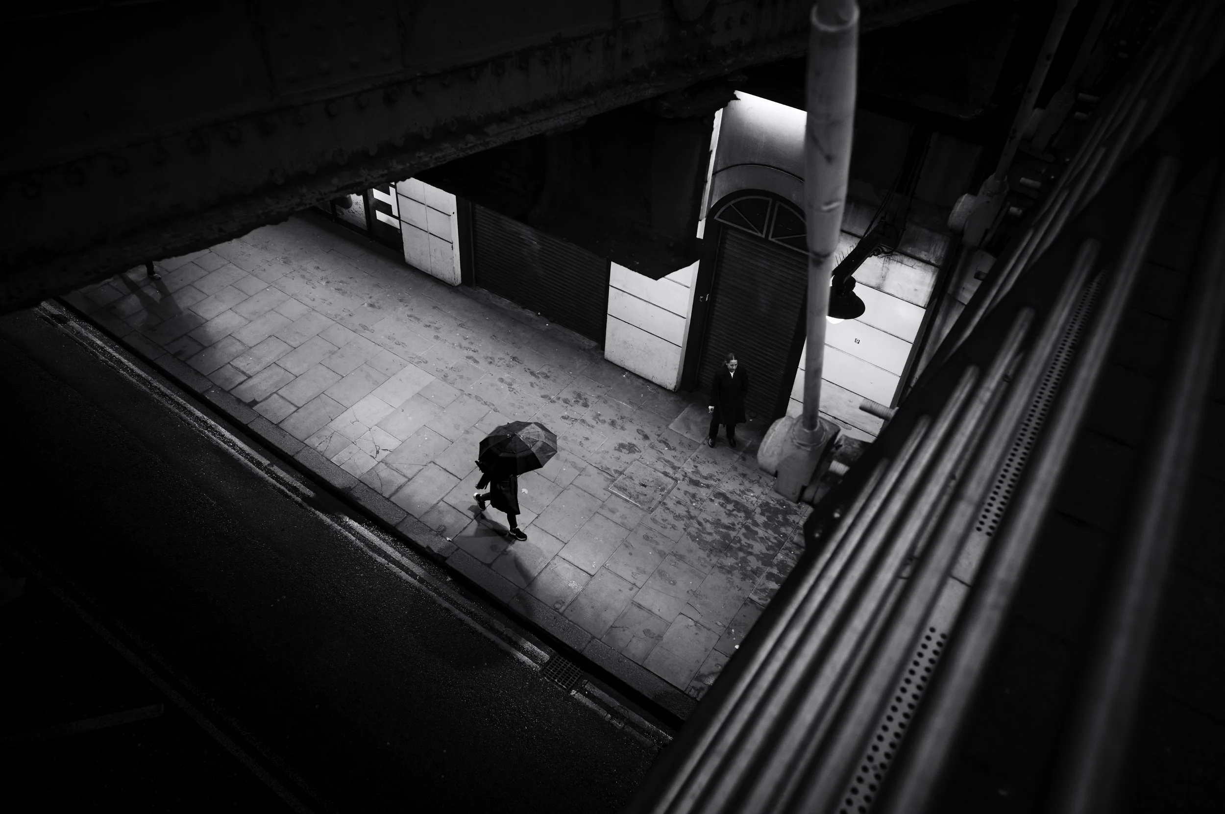
Heading Home is a picture of solitude. It’s about being one person alone in the machine or at least in the city. We look down between the girders of two Bridges – the footbridge across the Thames on the right and the railway bridge into Charing Cross on the left. It was a wet March evening and people were hurrying home out of the cold.
like the previous image, this is one of those places that I often pass particularly at the beginning of a photo walk. I always look down. Usually, the road is full of traffic either hurrying past in a blur or stuck still waiting for the lights to change. Tonight the road was empty. The pavement was also quiet.
Our heroine marches home, her umbrella providing shelter like a turtle’s shell, and casting a dark grey circular shadow on the kerbside. To her left is another woman, possibly on a break, cigarette in hand. Perhaps she is discreetly observing our heroine, ready to report back to her superiors.
On the far left, emerging from the girders of the railway bridge, there is the looming, shadowy presence of a third figure, about to enter the scene. Is our heroine being tailed?
The light reflected from the pavement is quite bright and contrasts well with the dark frame of the girders. It also shows up the wet footprints of her now departed fellow commuters. The busy day has come to an end but she is still out there.
In colour, the warm tones of the golden street lights and the blue paint of the bridge make this image tell a very different story.
Birdfeeder.
Chicago, USA. Aug 2023.
Leica M11 35mm Summicron
Birdfeeder was shot in completely different circumstances to the previous two images - it was outside and in harsh daylight. The harsh Chicago sun is almost directly overhead, as you can see by the small shadows cast by the woman and the birds. The concrete reflects the heat and light up towards the sky, the buildings almost lost in the deep black.
In fact, the shadows of the buildings create a geometric block in the top two-thirds of the image. This contrasts sharply with the bottom half which is bright white in places and roughly textured.
In the centre stands a frail old lady, pausing amongst the pigeons. Her feet are close together and her legs are spindly, much like those of the birds. She too is a black shape, only differentiated by her size and the flash of white light on her hair. She seems very vulnerable, dwarfed by the huge buildings in the background that we can only really imagine. Unlike the birds at her feet, she is unable to fly away. She almost looks as if she could be there forever.
Again, this is another image which could have been in colour. However, the graphic nature of the image with its straight lines, textured floor, and the contrast between the bright pavement and the black birds made monochrome the better choice.
Tailor.
Jermyn Street, London. Feb 2023.
Leica M11 24 mm
This image shows a tailor at work in his shop in Piccadilly Arcade, London. The photo is composed in black and white, because I think it really helps to draw attention to the tailor himself amidst all the clutter of his professional life. It's amazing how the human form always seems to stand out, no matter what the environment.
In the photo, the tailor is surrounded by all sorts of fabrics and accoutrements, framed by small boxes of cufflinks in the foreground, a staircase and banister to the left, and clothes in the window display to the right. The lighting from above really highlights the tailor and makes him the focal point of the image.
A man at work.
Whistles.
Cambridge, England. Aug 2023.
Leica M11 28mm
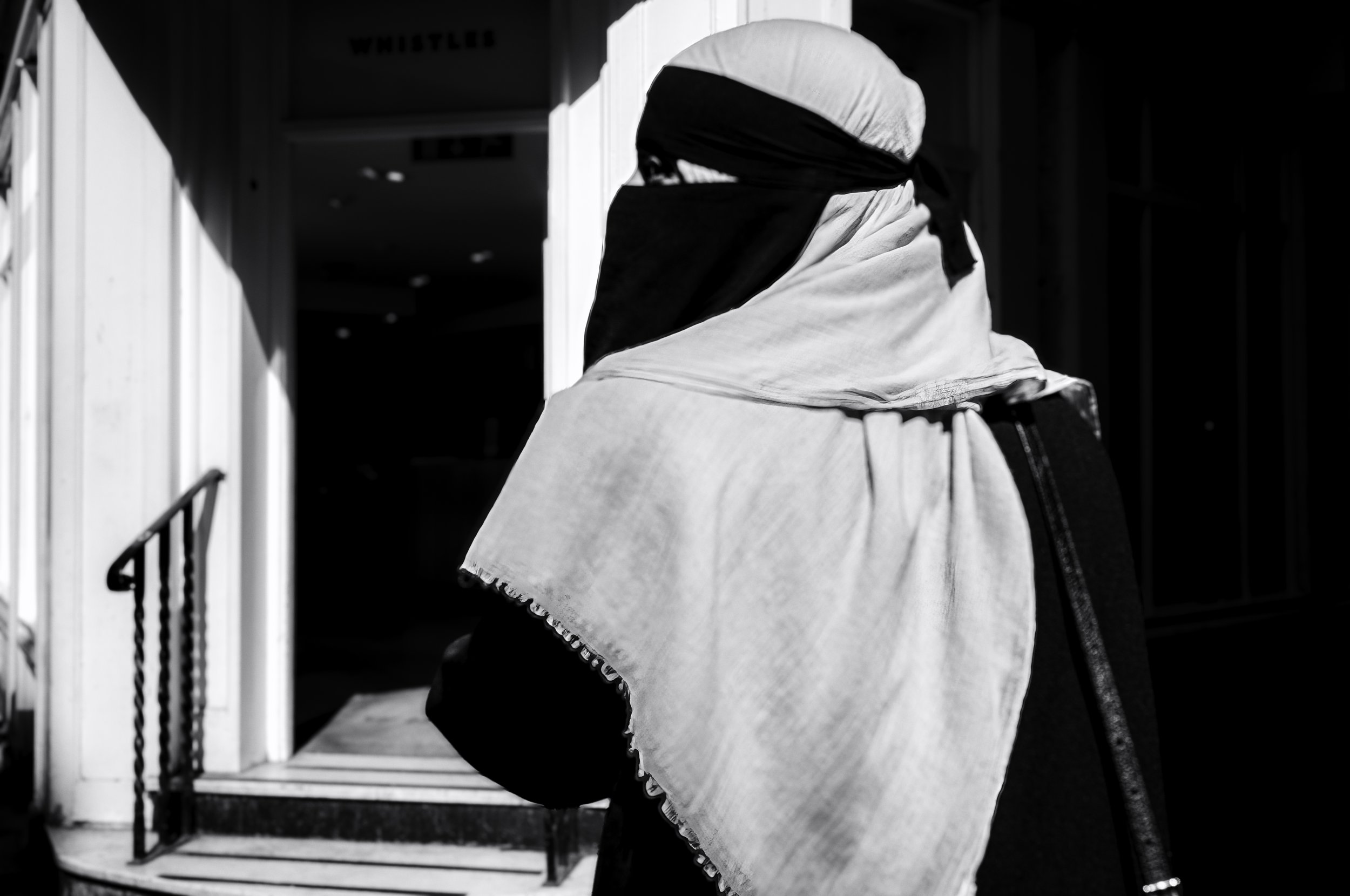
The final image I’ve chosen interests me because it is a portrait (candid, of course) but it is also quite abstract and geometric.
The original RAW file reveals that there is very little colour in the image. The woman’s clothes are black and white. The shop behind has white walls and a black door.
So, why bother converting it to black-and-white?
I suppose it’s a question of contrast. We all know that white light is made up of a whole spectrum of colour. The whites in the original image showed faint hints of yellow-golden light, of pinks and pale blues. In converting the image to pure black-and-white these tones become shades of grey, bleaching to pure white and darkening to full black.
Considering the image as a black-and-white photograph enables the viewer to focus on the lines, shape and form - the structure of the composition. To me, it is about diagonal lines – the shadow of the awning coming from the top left and reflected in the inverse angle of the handrail coming from the bottom left; the diagonal line of the woman’s shawl which runs parallel to the handrail; the diagonal line of her handbag strap, which also mirrors the shadow of the awning. Diagonal lines also form parts of triangles and it’s not hard to find triangles either implied or explicit in this image. The triangle of space in the fabric which reveals the only part of the human body on show, the left eye, is crucial to the whole image. It is framed in pure black which itself is surrounded by white and pale grey.
Whilst also only taking a moment to capture, it’s a complicated image because it contains frames within frames.
What's really interesting to me is how much you can see in a photo when you really take the time to look at it. These photos are great examples of how black and white photography can highlight different aspects of an image and draw attention to certain elements.
What do you think? Do you prefer colour or black and white photography? Let me know in the comments!


